Hamish Childs
Hamish Childs ContactI am a multi-disciplinary design director with over 15 years experience — specialising in brand identity, typography and illustration within the cultural and commercial worlds. I produce conceptually and strategically driven outcomes with expertise across print, built environment and digital mediums.
Ōtautahi Christchurch, Aotearoa New Zealand
-
Studio Round
Lead Designer
2018–Current
-
SouthSouthWest
Senior Designer
2015–2018
-
PidgeonWard
Designer
2011–2015
-
Strategy Design
Designer
2008–2011
-
Nike (Vendor #5119871)
Art Director
Ongoing
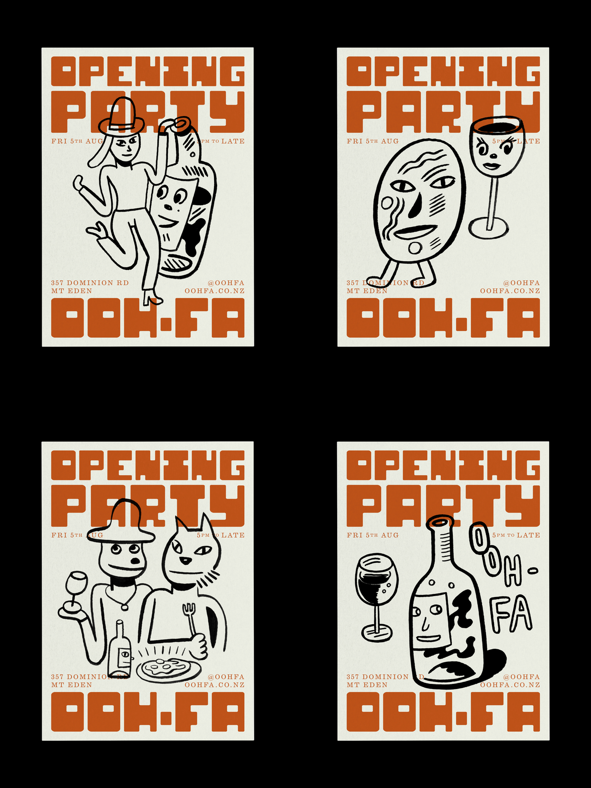
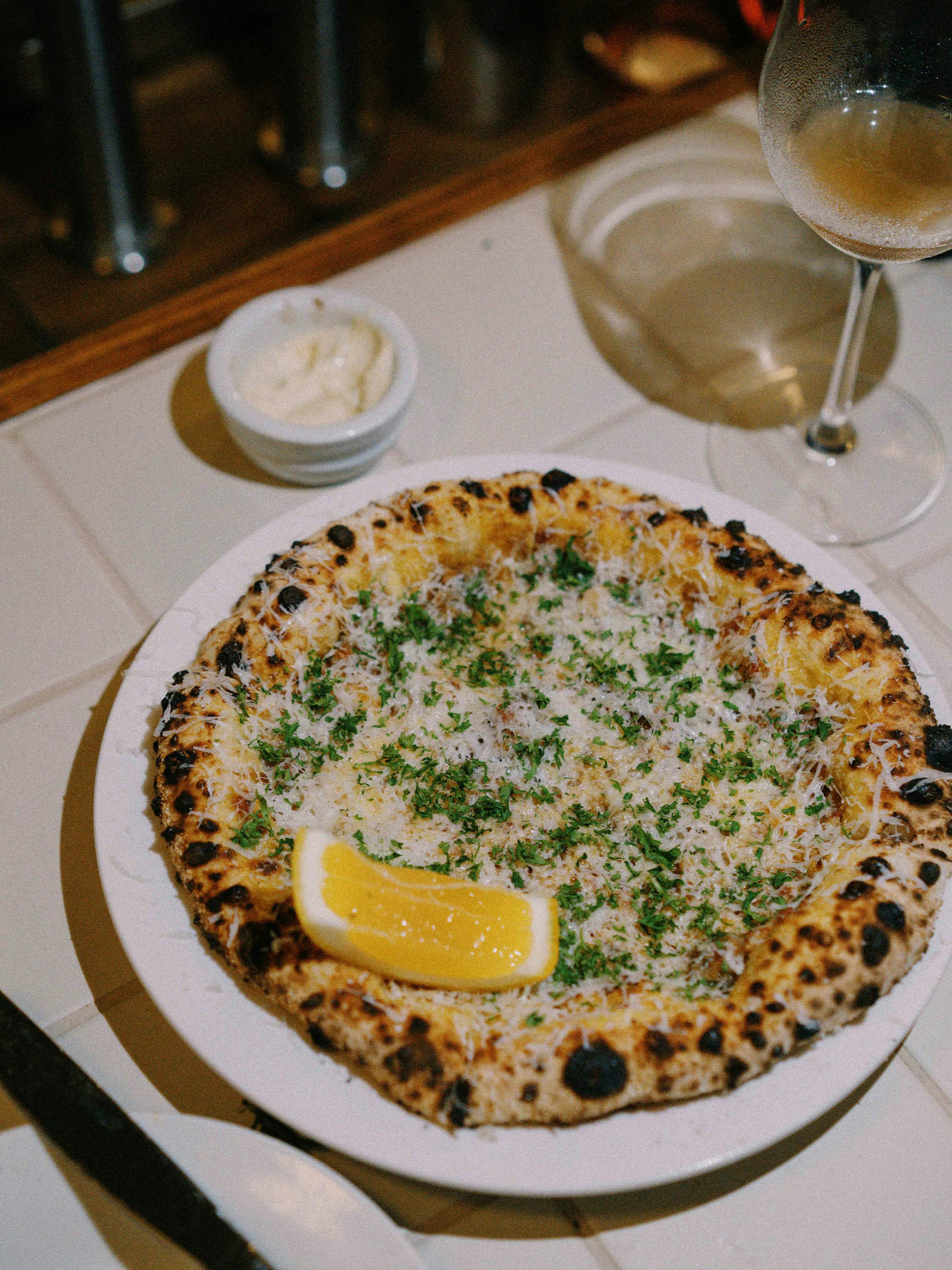
Ooh-fa is an anything-but-conventional pizza and wine resturant in Tāmaki Makaurau Auckland. Embodying the spirit of the anti-hero, Ooh-fa’s identity balances the good, the bad and the ugly with classic, retro and raw elements. 🤌
Illustrations by Jason Jägel







SouthSouthWest partnered with the Google VR design team to develop one of the world’s first kinetic virtual reality brand identities, the Google Daydream identity.
The geometry of the golden mean was used as the foundation for creating a sense of universal beauty with an intrinsic connection to the natural world.
The identity is comprised of an enigmatic form; called Eon, that functions as both an experiential virtual object and a reductive graphic symbol.
Completed at SouthSouthWest


A bold visual aesthetic developed at SouthSouthWest in partnership with Jordan Brand for all star weekend 2018 Los Angeles.
The graphic system was deployed across multiple event sites and brand experiences across Los Angeles from high school tournaments, invitational retail events and workshops.
Completed at SouthSouthWest


Part of the Boston Celebration Collection created for Nike, and co-branded with local run crew @heartbreak.run This fast and tough racing wordmark was made for all runners hoping to conquer Heartbreak Hill.
Design direction Diego Guevara and Chad Mann


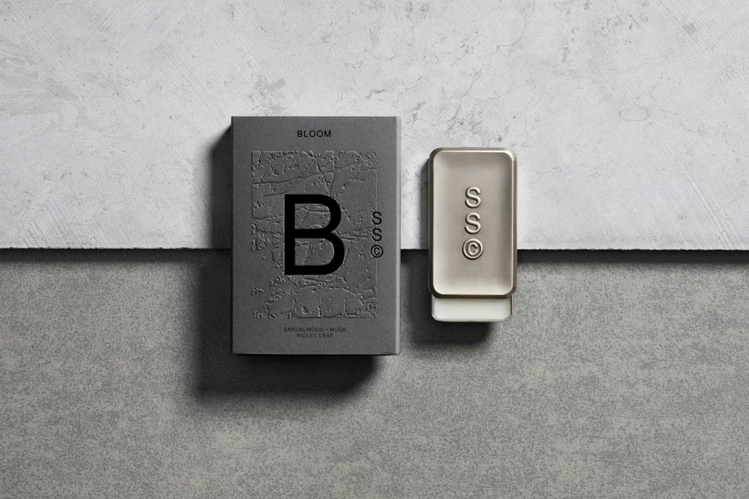
Brand identity and packaging system for Solid State, a fragrance brand that does away with the liquid. The brand looked to refresh and broaden the product story for an international audience.
Tactility was important to the brand expression, textures relating to the product ingredients were introduced through blind embossing.
Completed at SouthSouthWest

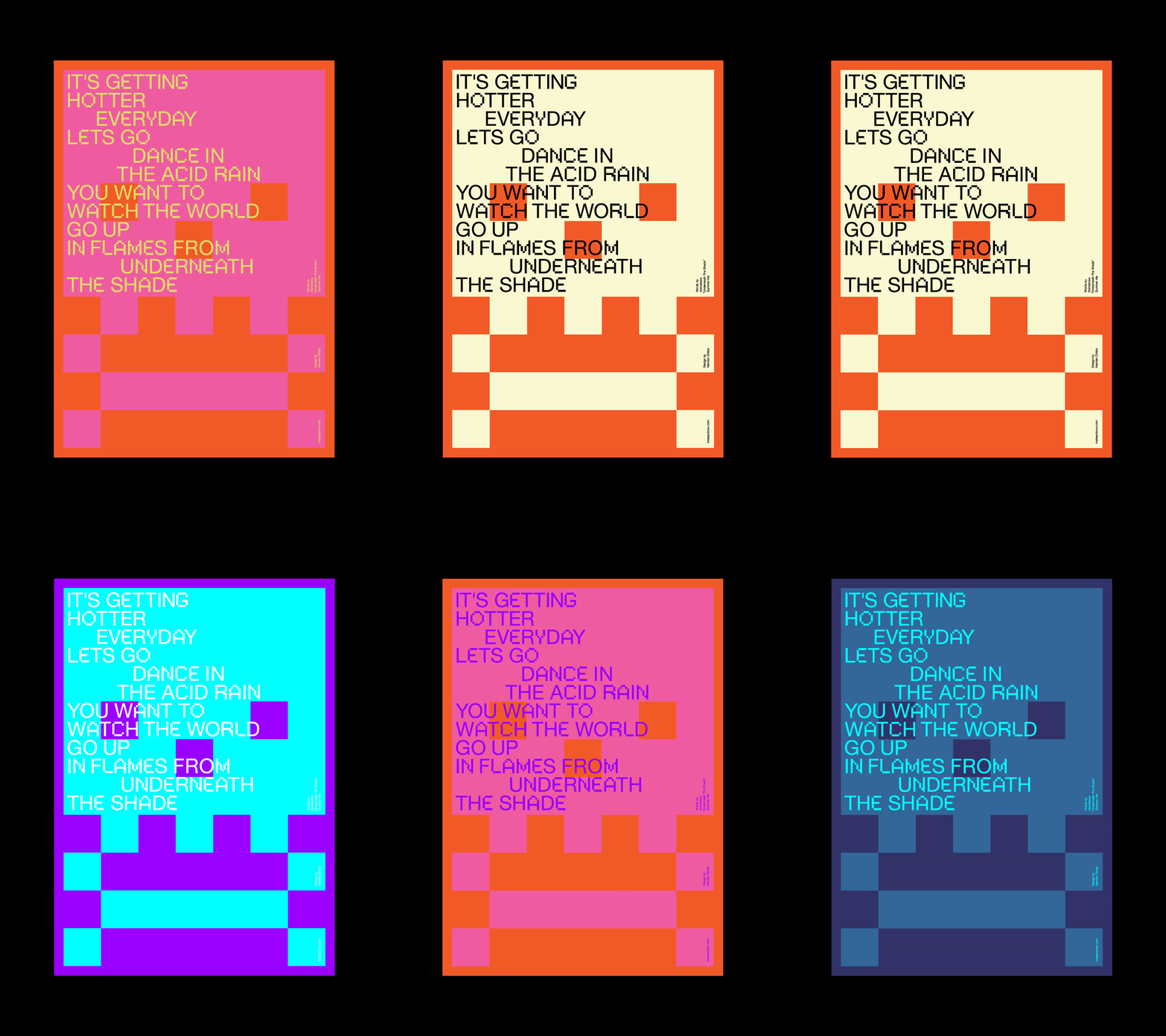
I was invited to create a poster for @mateactnow — Mate Act Now is a climate change poster protest for the digital generation — 100 posters protesting climate change and driving political action, to raise awareness of climate change and funds for the Red Cross Disaster Relief and Recovery Australia. Check out the full gallery of fantastic posters, buy the book, donate here.
Curated by: Chris Flack
Words: Home Brew "Under The Shade"
Typeface: Neue Pixel Grotesk by M35
mateactnow.com


Design for two books on photographer Rennie Ellis (1940–2003) for Hardie Grant Books in conjunction with the Rennie Ellis Photographic Archive. The first, Decade covers his work from 1970 to 1980 and is an amazing social insight into Australia in the 70s, its cultures and sub-cultures. The second, Decadent, covers the hedonistic 80s through to the Naughties. Many of the photographs are accompanied by extended captions written by Rennie Ellis himself and published for the first time.
The die cut, hard cover books serve as a valuable and genuinely unique window into all walks of Australian life in the 70s and 80s. The design of the inside of the book has been kept minimal to allow Rennie Ellis’ striking photography to shine and his unpublished captions to leap off the page. In most instances the photographs have been specifically curated and placed into pairs which creates an intriguing dialogue between them and form of social commentary.
Completed at Pidgeon Ward


Avantdale Bowling Club identity and album artwork designed for New Zealand musician Tom Scott. The identity stretched across mechandise, exhibition and set designs.
Photography by Luca Macioce & Taak Soropa.
About the album:
The album is a fusion of jazz and hip hop, featuring some of the best musicians in New Zealand—Jonathan Crayford, Julien Dyne, Ladi6, Mara TK, Esther Stephens, Teeks and many more.
Some words from Tom on the album:
This record is about… growing up. I think. It’s about dealing with your own stuff for once. Accepting responsibility, maybe. It’s a self help book addressed to myself. And just like every other piece of art ever made in history of the hominid, I was going through some shit when I was making it. I’d just left home and everyone I knew, looking to chase a dream. It was an awkward phase, like stage two puberty. I was learning how to be grown. Humility had my pride in a headlock. I was the old man at the art exhibition, the young boy at the art gallery. Everyone was in a K-hole, I was at K-Mart.
Awards:
2019 NZ Taite Music Prize
You can listen to Avantdale Bowling Club here


The Nike Stop Exercising Start Training campaign identity launched in Spring 17 across all channels and in training spaces globally. This campaign identity featured a bespoke typeface that pushed and pulled the iconic version of Monotype’s Trade Gothic.
Completed at SouthSouthWest


Bespoke typeface based on Trade Gothic, for the Nike NYC Marathon.

